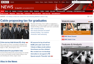
It does seem that I'm not alone though as a comment on the bottom of this Reg article indicates:
Widespread criticism of the redesign in the blogsphere over its confusing layout, unappealing appearance and the bone-headed decision to demote the prominence of sports coverage is another thing altogether.Exactly.. the navigation used to be very simple and clear but is now a confused jumble, there's an inexplicable amount of whitespace about the place, there's a stupid panel part way down with your local news that appears to have been designed by a different team entirely, and an overall inefficient use of space with unimportant elements being too visually intrusive. It's Web 2.0 crap in other words.. hell, it's almost as bad as Sky News!
(and before anyone comments, I know that this blog template doesn't work very well in Internet Explorer either, but then I haven't pissed away stacks of public cash on it either).
More unfavourable comments here


No comments:
Post a Comment